Nina & Nicole (1)
Hey! After some time with Nicole, I'm finally settled.
Our first week was spent organizing and setting up social media. We downloaded hootsuite, and from there managed instagram, facebook, and twitter as a business. I made two posts a day - one for The Station, and one for Eiland Arts Center. We've talked about business cards and fliers, and what events bring people in. We also took a trip to hand back art and meet the kids the we're going to be working with.
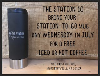
My second week there was focused on photoshop and actually making some of those graphics for immediate use. The first was an imagine for their email-based news flier, in order to promote their July free coffee. We debated fully digital versus using an imagine of the needed mug, what information was important to put on the flier, hand done versus digital, and on what platform it would be mostly viewed on. In the end, this is the graphic I made:
After that, I focused on starting to spruce up some of the signs in the coffee shop, and how to clarifying some merch so that customers would have less to ask and the information would be more readily available.


For next week, I'm preparing a redesign of a post card advertising the Eiland Arts birthday parties, and getting ready for our first week with the kids!
Our first week was spent organizing and setting up social media. We downloaded hootsuite, and from there managed instagram, facebook, and twitter as a business. I made two posts a day - one for The Station, and one for Eiland Arts Center. We've talked about business cards and fliers, and what events bring people in. We also took a trip to hand back art and meet the kids the we're going to be working with.
My second week there was focused on photoshop and actually making some of those graphics for immediate use. The first was an imagine for their email-based news flier, in order to promote their July free coffee. We debated fully digital versus using an imagine of the needed mug, what information was important to put on the flier, hand done versus digital, and on what platform it would be mostly viewed on. In the end, this is the graphic I made:

After that, I focused on starting to spruce up some of the signs in the coffee shop, and how to clarifying some merch so that customers would have less to ask and the information would be more readily available.


For next week, I'm preparing a redesign of a post card advertising the Eiland Arts birthday parties, and getting ready for our first week with the kids!


For making signs for the coffee shop, do you have to think about how your choices in fonts/images correlate to the aesthetic of the cafe? Is it difficult to make signs that look like they belong?
ReplyDeleteThe shop actually doesn't have a very set aesthetic. You can see that the previous signs were just handwritten in sharpie on labels. This means I pretty much get free reign to play with the fonts as I like! I do try to pull a lot of references from other coffee shops, but ultimately in this situation, what matters is that it looks nice.
Delete