Nina & Nicole (4)
The progress on the Shop Merchantville logo is really coming along!
Since Eiland Arts is in charge of the logo completely, we had free rein to do whatever we wanted with it - which also meant I had free rein to do whatever kind of style of type I wanted, since Nicole wanted to encourage my growth and, more than anything, wanted me to have fun with it.
The only limitation I had was that it couldn't be too modern, or it might not pass.
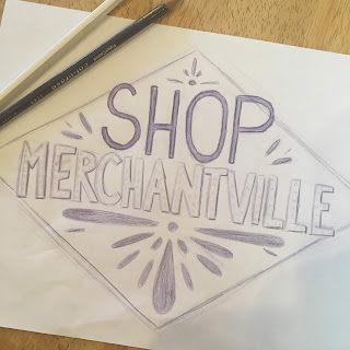
This is the "final sketch" that I came up with, just as an outline for design and style - not taking into consideration the kerning or perfect angles.
Nicole approved my sketch, and really liked the lighter lines inside of "Shop" but wasn't sure that the decorative insides of "Merchantville" would work, since they might give off a hollywood-lights feel. to compensate for that, I decided to move the light inner line into "Merchantville" instead, and to give "Shop" a different but simple texture.
 Here's the in progress final. I've used some free fonts to at as guidelines for the kerning and to help keep consistent bowls, and then have hand drawn the letters on top with a digital tablet. "Shop" is complete, but "Merchantville" needs to be hand drawn and the inner line cleaned up, as well as darkened. Then the decorations - currently in sketch red - need to be cleaned up, and it's done.
Since Eiland Arts is in charge of the logo completely, we had free rein to do whatever we wanted with it - which also meant I had free rein to do whatever kind of style of type I wanted, since Nicole wanted to encourage my growth and, more than anything, wanted me to have fun with it.
The only limitation I had was that it couldn't be too modern, or it might not pass.

This is the "final sketch" that I came up with, just as an outline for design and style - not taking into consideration the kerning or perfect angles.
Nicole approved my sketch, and really liked the lighter lines inside of "Shop" but wasn't sure that the decorative insides of "Merchantville" would work, since they might give off a hollywood-lights feel. to compensate for that, I decided to move the light inner line into "Merchantville" instead, and to give "Shop" a different but simple texture.


Comments
Post a Comment